A public dumping ground for words and pictures. Contact me at ThomasTamblyn@Gmail.com

Showing posts with label witches. Show all posts

Sunday, 15 December 2013

Pagemages and Boozehorns


These were me getting back in the saddle after a while away. They started with the pose, pulling something out of a book. The scarf was to add a little character beyond generic wizardliness. The robes are lazy I confess. I too often go with shapeless full-length robes, but I think the shading here gives them a bit more definition. I feel good about those creases. They're not great, but my first effort was so much worse. And I feel I've imrpvoed from recognising the problems and fixing them.
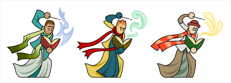
I'm sticking with doing vector colouring/shading, and I made the linework for these with that in mind. So I knew I'd be putting a coloured pattern on the scarves, and that I could demarcate #1 and #2's hair without needing to blackline it. Which is new. I used the "spare" lines left in the budget to put a little more expression on their faces. Not sure about that. I wonder if it would be better to do it on the shading layer. I think it's only a matter of time before I give up on the no-mouth line-eyes look. Style erosion.

The unlined spell effects are also new and I can see myself doing a lot more things along those lines. For these guys I deliberately avoided any sort of elemental theming. #1 has flames, yes, but they're blue so they're passable as a generic magical effect.

Next there's these satyr things. I had something else in mind while sketching, but the drunken faun is far more interesting to me. Very fond of the various boozes and goat-beards. The horns were an enormous pain in the arse. One of the downsides of vector colouring - that horn texture would have been much easier in photoshop.
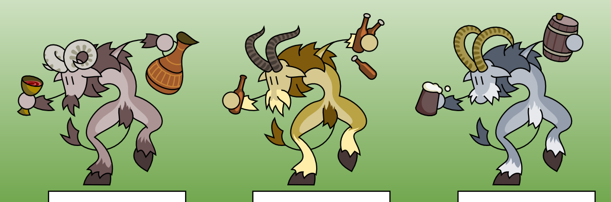
I think these satyrs are knights who have gone questing into the woods and been cursed for their unchivalric vices. In this case, the knights were drunkards. I could easily conceive of gluttonous pig-monsters and maybe slothful bear-men?

These cursed knights would fill a good niche in the theoretical game these are never going to be used for. I didn't feel like the forest witches were actually evil. Cursed monsters gives you something you can feel good about fighting, also making the witches more of a credible menace without making them evil.

Sunday, 16 October 2011

First nymph

It's some kind of insectile fairy/elf thing.  Nymph is an obvious name. Design is reminiscent of a whole bunch of different things.

The hair's a little weird; the way it has that extra wisp at the end. A little worried it looks like it's holding it in its hand.

Butterfly is cute but possibly unnecessary.

Didn't and don't have much of a plan with this one. I was of two minds as to whether it needed variants or not. I guess I could have done variations on the armour/carapace and hair, but I wasn't feeling inspired in that direction so I just went to the colours.

I like the mottling quite a bit. It could follow the implied depth a bit better, but I'm ok with it for now. Hair's highlights are haphazard.


Saturday, 28 May 2011

Plant elementals and Guillotine doll

 Another puppet/doll. I doodled a few of them and this was the other promising-looking one. It turned out as a bulkier-looking thing. No variants obviously - didn't seem to be much potential for them, though I may try different arm-blades and masks at some point. Maybe play with the joints or give it seams in the wood? That's not a bad idea actually. But maybe later.

The spinal-looking connection between hips and torso reminds me a lot of the safeguard from Blame!, which isn't a bad thing since they were one of my major inspirations for the puppet look. For the record, the others are Naruto ninja puppets, Devil May Cry's early enemies and the character Puppet from the Amiga game Body Blows Galactic. That guy's been stuck in my head for years.

The worn-away paint on the legs and feet was very effective here. Makes it obvious that it's a wooden puppet without too much detail, and makes it seem heavier on its feet than the snickerdolls.

 I think I want to make one or two more kinds of puppet. I have a design for one that's stalled at the linework stage because of a dodgy neck, and I feel like I don't yet have a generic or baseline puppet. The snickerdolls seem a touch too characterful to fill that role at the moment. I want something in ruffle-y clothing, a skirt perhaps and floofy sleeves.

Getting away from dolls but not abandoning wood. Plant elementals. Intended for the witches, though flower-guy would also fit in with the jungle island. I'm glad I've been able to do more with this technique for depicting plant masses. As I've said before, monsters tend to lack superficial details that I can swap about to make variants. Too much of their shape comes from basic structural elements.

Anyway. I have issues with both of them. Starting with the ore tree-like, his pose is weird. I wanted an awkward and not-right pose, but this is a bit too far. I can see an easy alteration that might fix it but I'm leaving it for now.

I drew tree-guy without a head, but he seemed to need something there so I added the apple. I think this was a particularly good idea, since it gives him a sense of identity distinct from a generic tree-man. Perhaps Applechild as a name? Ambiguous whether the apple is the brain or just the prize. I imagine that his kind are something the witches summon from apple pips.

Flower guy's right hip is my favourite feature. Also the uneven "eyes" on the mask. I worried a lot that the flower drew too much attention from his mask/head. I've been staring at the whole, and now I'm wondering if it would look cooler if I removed the head entirely. The pose would be reinterpreted with the flower as the head and the result looks like it will be quirky.

However I did all this thinking after I'd coloured it, so I wasn't going to muck about back at the linework stage. So I'll note the possibility here to come back to one day.

Sunday, 1 May 2011

Lunacy

I didn't want a brown werewolf. So apparently they're green now. That works for me. The grey-blue has the actual colours I worked with, but I liked the hue shift to green so much that he's become the definitive one. I love hue-shifting. So useful. It brings out colours and combinations I never would have thought of using. And they usually look a good deal more natural than what I drag out of the palette on my own.

The green works well though. I imagine the werewolf being part of the forest witch theme. His name is Gordon for some reason. Perhaps he's a not-virtuous-enough knight "blessed" by the moon to protect the wilds.


When I was playing with the colours I tried colouring the hair as fire. It didn't work. But it was fantastic as an autumn scheme. I'm going to have to try that in the future, maybe as a subtheme. I bet it would look great on the green men. A summer lineup and an autumn lineup would be aces. Maybe a spring one too, or would that be pushing it?

Yesterday I gave up in frustration over the left hand. I couldn't get the linework right. This morning I resolved to fix it no matter what, and opened it up to find it perfectly ok. Maybe I was tired and over-thinking it, or maybe brownies fixed it in the night. Either-or. Ok admittedly the hands are pretty crappy, but better is the enemy of done and I've found it easier for me to improve if I just move on and do better next time.


I tried too long to give him a mouth, but eventually I resigned myself to the fact that he looks pretty damn cool without one. The lack of a cliché snarl also makes him seem more "noble savage" than "frenzied horror", which works for the theme. My remaining concern is the feet. It would make sense that you can't see all his toes on one foot if he's stalking sideways, but I'm not sure that reads right on the drawing.

I am particularly happy with the colouring. I dithered over particulars for ages, but I think I've ended up giving him character without too much unnecessary detail.

Saturday, 19 June 2010

Sweep away the dust

What's going on here then, hm? Nothing much. So let's see about that then, hm?

I'd been stalled on these you see and had largely given up. But last night I sketched a dashing fellow with a wand. I scan him but before I even start on his linework, these unfinished broomboys catch my eye. Before I know it I'm dropping nodes and aiming arcs and shopping colours and here we are!

They felt a lot more androgynous while I was making them, but midway during the colour stage I had to face facts: these are men. Well, young men. Boys really. To my eyes at least. A second flavour of apprentice I guess.

Remarks:

#3's hair was added well after colouring had started. I decided he needed something more and so I went back and biddled with the lines. A little awkward to update the linework on a WIP colour piece, but it's all for the better.

#2's hair is silly. I'm trying hard not to think "Dragonball Z" when I see it. I like it though. Looks autumn-y.

#1's hangy bauble looks to be tugging his hat down. I like that. I'm not terribly good at making things feel weighty and solid, but this is a nice exception.

The brooms were all utter arse to do. This art style is not broomhead-friendly. It was one of the big things I stalled on way back when I started this (#2's hat was another, but big hair to the rescue).

The initial sketch was far more ambitious. Unfortunately it also wasn't very good. These are yet more static-looking flatfoots, but they're much less offensive to the eye than they might have been.

Dissatisfied with the faces. They're looking downward in an uninspiring and vaguely morose manner. I'm leaving them like that for now, but if I come back it'll probably be the first thing I fix.

In the future I'll try and take a crack at the new sketch that these distracted me from. I'll wait until there's something else I should be doing. I also have some more limes I could post up if I felt the need. Or I might wander off and forget about this nonsense. Time will tell.

Wednesday, 10 February 2010

Zephyroth

Mission accomplished. Here's a before-and-after comparison. And I remember being so chuffed with the guy on the left when I did him. He's a bit of a mess to me today. I'll probably feel the same about the new and improved version in a few months. But for now I've got that warm glow that comes from making something better.

I kept the basic shape - I think I was really on to something there. I took that little jag at the top of his body and gave it some company, going for a slightly more ragged appearance. The baby Zephyrs are plump and smooth, but the big daddy is fiercer-looking.

I also got rid of most of the edge-lines. I decided that the ribbon-like appearance had to go. Besides, I have colour to add shape.

Speaking of which, I used the whites as more than a highlight here - also using it to add some extra detail swirls. My inability to do proper lightning has created a semi-transparent, almost glass-like, feel. A happy fluke.

The lower shapes are darker and browner, as if he's picking up dust from the ground. No leaves - I didn't feel he needed them with all the extra lines he has. And as a whole he's less saturated than the baby Zephyrs, which is an easy way to use colour to distinguish between child and adult-looking critters.

Woo.

Wispy

I never did manage to get those pixies looking right. I was thinking "glows with wings and maybe light trails" but it just wasn't coming together. Shame. But these fill the same niche.

They're wind spirits of some kind. Perhaps elementals? Meh. Cosmology comes second to imagery. They're critters rather than peeps, which is nice for change. I didn't think they were interesting enough on their own so I gave them gust FX as bases/stands.

Little leery of the high linecount on the leaves, but they don't look out of place and I think they're pretty. Also they're great scene-setters. I think they make it obvious that the swirlies represent wind, and that there's a forest context. I tried to arrange them in sensible patterns like they're blowing around rather than just randomly scattered.

I wasn't sure about the arms. Worried that on something non-humanoid, stick-and-ball arms would look like antennae or something weird, but I think it works ok. Together with the eye/face it anthropomorphises them just enough.

Also unsure about the colour. The swooshes look nice with that greenish tint, but the critters themselves... I didn't know what to do. Blue seems traditional for air elementals but it's not quite right. I didn't want to take them all the way to stark white though. Maybe I should have? I also thought I could do something with another colour on the eyes, but it ended up making them look like they were peering out from hoods.

Details are totally unswappable. Swooshes and critters are carefully matched and posed. I don't feel bad about that though, since they're all total redraws.

I've got an old whirlwindy-looking critter that I think I should revamp. He'd only need a little tweaking to match these guys' style and would make a nice boss-type version.

Sunday, 31 January 2010

Girls out of hoods

I've been suffering from a lack of inspiration. Or, more honestly, a lack of accomplishment when trying to execute my inspiration. So I decided to get on with doing what I had been putting off: revamping old veeps. Since I've been doing witches, and the apprentice girl is one of my favourite from the pre-blog batch, I made a move on her.

There she is, on the right. The swoosh is a bit clunky and there's more lines than whitespace on the hat but all in all: woo.

I was thinking she was some kind of wind witch or apprentice that lived in the forest. A little bit red riding-hood.

Which was a nice enough idea.

I thought she'd end up completely redone, but in the end it was just small tweaks. One thing I was sorry to lose was the swoosh running from behind her legs to in front of her hand. Shame. Even tried to do it on one of the new witch girls but it just wasn't happening. I'm not displeased with the foreground swooshes now you understand, just something that might also have been cool.

So! I borrowed some leaves from a green man and that was the first variant done. Misc swooshes for the others. I'd have liked something different for the third, but I was at a loss for another way to represent a gust of wind or foresty power. I have a couple of failed experiments banked in case they're good for something else.

You know, except for #1's skirt these are pretty androgynous. #2 especially; fey but not necessarily feminine. A bit Peter Pan maybe, or a bit lost boys.

I'm happy with the level of outside-the-lines detailing on these. The shaping for the swooshes, #2's crinkled cape and #3's leaf-trous. Perhaps mushroom-head's spots would have been better as colour detail rather than linework, but that's just doubt speaking.

Things I don't like are mushroom head's cape. The shading is a bit forced, and the lines down the side are mysterious in their purpose. I reckon that'll be somewhere to pay attention if I come back for another pass.

Colour schemes came easier than I was used. I'm glad and surprised to have three coordinated and appropriate schemes here. It's been a stumbling block more times than I'm happy with.

Yeah, all in all I'm rather happy with these. Hooray!

Now, who to do next? One of the pirates would help flesh out that "tribe", or I've some knights I rather like. A woodsman archer with a novel pose that might fit with the witches. One of the early ones with plenty of room for improvement?

Undecided!

Saturday, 23 January 2010

Second dose

Revisions!

Turned out I was frustrated enough with the poison-pickers that I took another whack at them. Not just colours, but linework too. Number three, the only one I was really happy with had the privilege of remaining unchanged.

Number two got an extra line or two to make her sash's path a bit more obvious, and raggedied to look less like an apron. And a hat of course. A hat that screams "witch!".

Number one's still a bit dodgy in my eyes. The strange poofy hat is... strange and poofy. But I'm much happier with her mantle and torso now. The colours aren't ideal, but I can live with them.

I even put some extra crease detailing on the cloth. Nothing for number one unfortunately, but I'm much happier with these three as a set. They look witchier to my eyes. Even if you start swapping parts about. I've a feeling you could swap legs and torsos separately; they're not built for it, but it wouldn't be a huge mod. Perhaps even the unique details - mantle, gloves and cloak - could be moved about. Possibilities!

Even with #1 not totally satisfying, I'm content say these are as done as I need them to be.

Sunday, 10 January 2010

Pickled Peppers

I like the idea of these, but they're somehow bypassing the part of my brain responsible for inspiration. Especially the colours. Drab drab drab. I think I wanted an ecclectic look for the witches but they're turning out too mundane. I need to come up with more distinctive motifs. At the moment they just come out looking like random women.

Third one's ok though. I like her hair.

My thoughts were to give them all something that could be delicious/beautiful or poisonous. Apples are a sleeping beauty thing, you see?

Number one is so brown. What went wrong? And number 2's sash/apron defies human logic. Gah - I'm just moving on.

Bleh. There'll be something salvagable here I think (unlike some of the university wizards which I will no doubt scrap completely) but I don't want to look at these any more right now.

Sunday, 13 December 2009

Rumpelstiltskin

They were going to be crones. You know; maiden, mother, crone? But ended up looking too youthful to be crones. They don't really look like spinsters either. Barely like witches. Unless they're some kind of urban domestic witch.

The linework just wasn't coming together at first. It was missing something. But once i added the bustle it all fell into place. Goes well with the floofy skirts too.

Still, I didn't want them looking like they stepped out of a stately home. A bit of elegance was nice, but it needed to be brought down to earth. That's where the oven mitts and steel toed boots came from.

In fact the more i think about it, the less appropriate "spinster" seems. These are independent non-nonsense young-middle-aged women who have chosen their own way. Not going to bugger about fixing a placeholder filename though.

Colour creep continues. Dot patterns, quilted gloves, mud stains, pleats and embroidery. I may have to tone it down a little - I can't keep up this standard. The mud splats are probably too much. The quilting is necessary though, and the lacey embroidery makes #1. Just loopy mouse-squiggles, but it worked well enough when I zoomed out.

Modular: Body, implement, critter, head. Also each alt has a "floating" detail. In order: gloves, toecaps and sleeves.

I'm fond of #3's hair. I thought for sure I'd already done that on the swashbucklers but a quick flashback says no. Which is nice.

I'm wondering where these particular ladies fit in the witch taxonomy. They live in the cottages I'm fairly sure. They're the sort that tuts disapprovingly when the apprentice comes in. And they're probably a lot more outsoorsy than they look.

Thinking too hard about this. Maybe it'll feel more natural when I have an obvious continuum of wild -> domestic. And if not, they'd fit in fine at the university.

Fallacious argument

Wicker men. Very liney; I felt I needed to dump some of the responsibility for the texture on the linework for this one. The basic body shapes are so simple though, even if the hatched lines look more detailed than usual it balances out. And I used the colouring to pick up a lot of slack.

These aren't two alts of the same thing - they'd be functionally different. I started with the burnt husk but I wondered what it would look like with the fire. I don't know which is the "real" one. Fuego is flashier, but I still like the wicker husk. Maybe there's a way to get away with using both.

I'm getting further and further from what I originally felt the witches would be like. These and the scarecrows could well be the foundation of a new set. They may yet work as a "sub-zone", where you start off with all these scary stickly men and then things get leafier and spirit-ier as you progress. Could work. I'm not terribly fussed right now about rigid taxonomies.

The colour texture is a bit bodgy. Wasn't too well thought-out. It's good enough that I don't feel like tinkering further. I like the fire - it looks ember-y. Different to the firefox, but in an appropriate way.

Saturday, 12 December 2009

Rattle traps

I was thinking, the witches lack low-level fodder. The green man and knight seem too nifty to be rank-and-file. So I wondered about some kind of allied/bound minor forest spirit - faerie or pixie swarms perhaps, or dryads. I had some promising ideas in the faerie swarm direction, but in the meantime I made some scarecrows.

They seem the kind of thing that might patrol the border between the farmlands and the forest. Scary but a little silly too.

At least that was what I thought, but the final things are a bit more Halloween than what I had in mind. Maybe the pumpkin's too much. Pitchfork has my favourite head and I wonder it wouldn't have been better to keep them all having non-head heads. A bucket, or a floppy hat for example.

One of the problems of doing stickmen is how to distinguish things that are meant to be more stick-like than normal. Here I did it with the little bits of branch and the way the limb-lines cross over rather than joining neatly. That combined with the posture and ragged clothes should (I hope) make them obviously scarecrows. Unfortunately that leaves them with a lot of lines and not many areas for colour. At least it makes them distinctive.

Scarecrows are normally straw-stuffed, but that would involve a lot of extra lines to look adequate and I didn't have the budget for it. These are pretty heavy already. Though if I do another type of scarecrow it might be a big plump stuffed or wicker-man type.

Details I like: #2's right hand. The pin holding on #3's sickle-arm. #2's pumpkin stalk.

Colouring was dull in both senses of the word. I tried, but couldn't come up with any effective textures. Even my tries for a shine on the metal blades looked poor. Decided to leave them with the flats and move on.

Modular bits: Head, torso, legs, boots, each arm. Though I'd probably lump together torso+trous, or trous+boots. And I drew the arms as pairs so I'd worry about the "balance" of them if you mixed+matched. How likely is it that I'll ever get around to actually playing with modular parts? Not very! But it's fun to imagine.

Might do either the faeries or a wicker-man next. Or not.

Sunday, 6 December 2009

They're all thumbs

More green for the witches.

I tried to live up to the level of detail on the green knight with this. It was a fair bit of work (as might be expected) but I'm really rather pleased with it. At the moment this guy and the green knight are probably my favourite coloured veeps.

Like the green knight, I was inspired enough that I went straight from vector to colouring. However! Unlike the knight, I then went back and made some variants. Modules are: Head, mantle, Axe, Near cloak+leaves, far cloak+leaves.

However, colouring was so time-consuming that I've left the other two variants white for now. I'd really like to try an autumn colour scheme in the future though.

My thinking when I first sketched the green man was that it was a loyal follower of the witches who dressed up in leaves as a kind of homage. That's why the mundane weaponry. But when I was vectoring it, I hit on the floaty leaf element and decided it would be cool to have him disintegrating into/shedding leaves in the wind. This gives it a more elemental/ethereal look. The axe still works for me because of the English folkloric associations. It could go either way still to be honest.

The variants could be more different. Rearranging leaves is fiddly, but doesn't lead to any huge differences in style. Perhaps I should have gone for some seriously drastic changes - like a hooded head and a deer skull head. But that'd probably be too drastic.

I'm happy with the different axe heads though. I was a little worried they'd be trivial since outlandish ornate axeheads were inappropriate for the concept, but I think I got three different, robust-looking axes.

So yeah, woo. I finish the weekend flushed with success. It feels nice to be inspired, nicer still if it leads somewhere. And I raised the bar on what I can manage with colour. I have three entries for the forest witch bestiary with a fourth ready to be added and two concepts bubbling away in my brain.

It can't last.

Shepherd's Respite?

A champion for the forest witches. I may have gotten overexcited here.

Did the sketch last night in bed. Burst of creativity. Leapt straight from vector to colouring without making any variants. To top it off I went OTT with the detailing.

But I like it.

The vine limbs: I was happy with the compromise between volume and stringiness in the line work, but come colour time I saw an easy way to make them vine-ier and I took it. Also a little watermelonish but.... let's overlook that.

The rust was originally moss, but it worked better after a hue shift and a drop in luminescence. It's probably the detail I'd drop first to tone down the knight. I did have full two-tone on the shield, but it pulled it into the forground too much, so I dropped the light spackles. That works.

Spikes on the morning star also got a little extra colour. It's hard to be restrained; start tarting up one bit and everything else looks too dowdy.

I could make variants for this I think. Changing up which bits are armour and which are vines, different weapons/shields and helms. But I'm happy enough with this as a (temporarily) final piece that I don't feel like fiddling right now.

Something I want to point out; on the sketch he had a chipped sword and a kite shield. The hilt+hand largely obscured the knee plate, so I went for a hafted weapon. Besides, I have too many swords. After looking at it for a bit, I had an idea and made the shield a round wooden one. If this is the vine-animated armour of some long-dead knight, then his gear is going to be a bit old fashioned. My undeveloped knights theme has a lot of kite shields and swords you see, so this differentiates him.

Hmm - is he animated by the vines, or by the spirit of the dead knight (with the vines serving as surrogate body)? I don't know.

Might try remaking the vine golem with some of the new tricks I learned here. He's too fiddly at the moment and could do with some variants. Something for a rainy day.

Sunday, 29 November 2009

Turn the light off!

A bit spindly. Doesn't make good use of horizontal space. Arm lengths are skew-whiff. Staves have nice shapes - #2 in particular. Liking the bobby pin in #3's hat.

I spent too long trying to come up with alternatives to #1's sack. In the end I just went with varieties of cloak. Shame. A bundle of sticks, or a wicker basket might have been nice but I couldn't make them happen.

The colours are OK. I was trying to strike a balance between naturalistic and colourful. I think that worked out.

I'm getting annoyed with long robes. They're too easy, and I've been doing a lot of them. Must do more legs. Voluminous, baggy trousers.

The pose is OK. It's pretty much what I wanted - a hunched look. They're still more upright than they could be, but I think there was more to be gained by just finishing them off and going for a proper full-body hunch with later attempt.

May do more witches (and associates). I've got an old veep I'm still very happy with that would be a fine young apprentice to any old lady of the woods. Beyond a couple of witch/apprentice variations I think they could do with forest spirit allies. Pixies/sprites or something (will need to come up with a good way to make them look ok in this style). Perhaps leaf/forest golems.