A public dumping ground for words and pictures. Contact me at ThomasTamblyn@Gmail.com

Showing posts with label icons. Show all posts

Tuesday, 21 May 2013

Icon style guide

I've made a lot of icons, and I've tried to keep them to a particular style. That's a little pretentious - my style is a crutch to hide a lack of ability. Still, it's hard to draw over 1600 little pictures without getting better at making them, and so I've suffered quality-creep. The ones I make now are often more illustrative and less symbolic. I include details that, back in the first hundred, I might have abstracted.
  Every good icon I make makes its predecessors look worse, and as I get better I'm making more better icons. 

Still, there's some consistency. From the start I developed a set of unwritten rules about how my icons should look. There's a few exceptions, but they're almost all due to oversight or moral weakness.

White on black
Everything is white shapes on a black background. If I want to do something in black, outline it in white, or put it over a white shape. When actually using the icons for something I can invert them if necessary, but for consistency when browsing the base icons, they're all white on black.

Sharp black and white only
It seemed silly to bother with colour permutations (red heart on black background, black heart on yellow background…) for the icons when that's so easily accomplished in a paint program. I can colour, paint over, use as masks on a gradient or anything else. The simplest possible base icons enables the greatest freedom when using them.
This is why I'm always a little annoyed to see them used as-is; just white shapes on black squares. They were never meant as ready-to-use icons. They're stencils.

Border
Nothing touches the edge of the frame. There's an invisible 1pt no-go zone. Again, this is just for consistency amongst the base icons and ensures I have some bleed when I cut out the icon to use elsewhere.

Fill the frame
The icons are always as large as I can get them within the frame. They'd be much less useful as a set if they were all drawn to different scales. If I need a small heart (for example) I can just scale down a large one. If I really wanted a small heart icon I'd give it some kind of framing detail.

Left to right
Consistency. If an icon has a direction, it's going left to right. Up vs down is more flexible, but when it's isn't common sense I tend towards top-to-bottom.

No lexical symbols
These are meant to be illustrative. No letters, numbers, currency symbols or overly specific symbols. If I needed a letter or a number, I could raster it from a typeface. And if I do one digit I should probably do all of them. Likewise letters. Hash marks are illustrative enough that they feel ok. There's an omega too.
 
Not too specific
I don't want twenty different flavours of axe. If I need a specific icon for a specific variety of thing, I can make it to suit. One or two axe icons will fit most needs. And the icons are supposed to be symbolicaly illustrative rather than perfectly specific anyway.
I've bent this one a lot, but I ration myself. There's a lot of different swords and botles for example, but I only do them every now and then so they don't take up too great a fraction of the total. And I try and make sure they're all sufficiently different from each other to be worthwhile. I'm not interested in doing ten different helmets with only slight differences.
I suppose this one includes other people's trademarks and logos too. No Samus helmet, no buster sword and so on. For several obvious reasons.

Not too abstract
Counterpart to the previous rule. If I need a circle I'll draw a circle. Likewise an arrow, a diamond or other simple geometric shapes. The icons are meant to be illustrative and there's a point at which a shape is too simple to illustrate anything. I've done a few miscellaneous weird shapes, which could be glyphs, thingamabobs or jewellery. The problem is that they're so easy to do I could easily churn out a hundred of them. But even if they're pretty, they're meaningless. There's not much difference between having a half dozen available and having a hundred. They're not challenging to make and usually a waste of time, so I don't let myself do many.

Definition and resolution
This is the most important one and the biggest pain in the arse. There's a minimum line width of 1pt. And that includes negative space - two separate white shapes need to have a 1 pt separation between them. This is my minimum "resolution" for detail. No bumps smaller than 1pt, no shapes smaller than that.
There's necessarily a little leeway where two shapes come together to a point, but I stick to this rule hard as I can. It puts a hard limit on the level of detail I can put in and keeps things consistent.

Line standards
Lines get squared-off ends. If the icon really needs it they might get a taper. But usually not. And no taking the piss either - If there's a taper then it should be a short taper. Sometimes there's a drawn element that is only the width of a line, and then I might round off or taper the ends but, again, usually not.

By the way 
The coloured icons in this post are just sloppy five-minute jobs to make a point.

Sunday, 27 September 2009

Sit and click

A friend asked me to make some icons for his Second Life rides and I was in the mood.

I'm not an SLer myself, so I couldn't tell you why having to sit on the seat is non-obvious, but apparently it was.

My brief was to create two icons which illustrated the concept of "First sit on the seat. Then click on the seat to start the ride"

I'm pleased with the body language of the guy in panel 1. That's some good sittin' even if I do say so myself. I think it's the eyes and the outstretched hand that do it. Plus the off-balance posture and twist of the hips.

The click panel is adequate. He has happy eyes because he's waiting for the ride to start. The chair that you have to click is highlighted, and indented as if it was an icon actually being clicked by the pointer.

The captions were not my idea. If you ask me, the whole point of an icon is to replace text. Giving them a caption is like giving a cruise liner a wetsuit. But he was putting text next to them so I figured I'd at least make a non-ugly icon/text combo.

I was helpful!

Sunday, 9 August 2009

Thee hundred and sixty-something

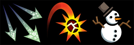
Here's another batch of icons, made much more recently than the others. As you'd expect they're generally a bit more intricate and involved. Detail creep is hard to stop. I've been going back over the old ones every now and then and revising ones that my quality threshold has overtaken though.

I obviously had TF2 on the brain when doing these. The broken bottle was demoman-inspired (although it may well be appropriate for those grog-swilling bravos). To its right we have a misc spiky ball that just happens to look more than a little like a sticky bomb.

Down the left hand side you'll see that I finally managed to make a backstab icon that I'm happy with. And was so pleased with the new hands-and-knees dummy silhouette that I used it again for a "backshot" icon and, on the bottom right, some kind of" oppressive cold" or "crushing despair"icon. I do like that silhouette, so hopefully I'll find some more uses for it in future. Next I need to make a good running silhouette, maybe based on the ubiquitous EXIT man.

The moon on the middle left is quite a bit simpler than most of these other icons. I remembered an old file of icon-type pictures I'd made before (they were originally intended to be alternate card suits) and adapted most of them. This one resisted any embellishment though - it works for me as is, even if it is rather plain and straightforward.

I'm fond of the half-full glass heart on the bottom row. It's probably the most intricate one I've done so far, and it's tempting to remove the highlights to make it fit in a little more with the others, but I can't bring myself to dowd it down. The book and the eye too are more 3d than most. Must be careful not to raise my standards beyond my ability.

I decided to experiment with colour again for this sampler, and see what it looked like if I "painted" them rather than just using a single flat-fill colour.

It was a worthy experiment, but I'm unconvinced by the result. Some look nice enough, like the heart and the fires, but others just look wrong. Some of the iconic representations like the backstab just reject any attempt at illustrative colouring and the result is a little embarassing on them. I also tried blurring the lines between the role of the linework and the colouring for the thorns on the top row. Failure.

Also, seen as a group, they just look incoherent and ugly. The single flat colour style complemented each other far better and I thinkI actually prefer even the black and whites over these. There's a few where colour helps make what's being depicted more obvious - the bubbling chemical vat for example, but overall it's not worth the bother I think.

Sunday, 5 July 2009

Spinning wheels

I made these on my big page of icons. They're too abstract and detailed to really be a part, but they were fun to make and that's what counts. Maybe I'll come up with a use for them later.

Rotational symmetry makes it almost too easy to come up with something tolerably attractive, but I still tried to be as interesting as I could. While making them, I had in my mind that these were physical objects - talismans or something - so I tried to make elements pass over and under each other to give the impression of depth.

It seems that I really don't have much to say about these. I just thought they were pretty.

Saturday, 23 May 2009

The dangers of unbounded science

Someone prompted me to make a warning sign for causality violation. I came up with these two. And a related "closed space" warning sign. Made very quickly, hence the wacky font; I re-used the basic warning sign template from a team fortress 2 spray I'd made.

I think the one with the question mark is the best. It looks properly geometric as well as symbolic. or at least it would if it was in a serious font. I could easily see it become the kind of sign you end up recognising as a holistic image rather than a combination of symbols. I like the idea of the closed space one, but am unimpressed by the picture.

Wednesday, 6 May 2009

Talking about icons

When I was making my icons, I looked at a lot of existing ones for inspiration. Also to steal. I've liked these cute little symbolic graphics ever since I first saw them in Diablo 2, and so I thought I'd blather and over-think them a little. Or at least, the ones whose icons I can easily gaffle from the web.

Diablo 2's icons are all silver silhouettes on brown. They're made to look like they might actually exist in the world as glyphs. There's drop shadow and texture, and the silver symbols don't touch the edge of the glyph plate.

In the game these icons are displayed at a fairly large size, and with few on screen at a time, so they can get away with a lot. And yet they're pretty abstract. This means that while you may not know what a given glyph is meant to represent, you can still recognise it pretty easily in a crowd.

I think that the texturing actually harms the readability of these icons. In areas of high detail, the grey lines on the white confuse the shape slightly. Very visible on the second glyph on the bottom row.

World of Warcraft. Warcraft 3 had almost exactly the same style icons, but they mainly portrayed units and are less interesting to me (though most of them did get recycled into WoW. More on that later).

These icons are actually small illustrations. The icon frames are like windows onto a larger scene, unlike the or symbolic Diablo icons. They also use strong colours and high contrast to make the icons even more distinctive from each other. Necessary, since WoW gives you a bar of relatively small icons to select from and it's easier to pick out colours than shapes at a glance.

This small display size does mean that a lot of the detail is wasted in play and you come to rely on recognizing the colour and rough shape of an icon, often with little thought to what it's a picture of. Still, if you take care to look they do work to illustrate the skill in a way that the Diablo icons don't.

Another problem with these illustrative icons is that they're harder to make. As a result, WoW re-uses a lot of icons for multiple skills and/or items. It's simply too much bother to commission a new piece of art for every single new ability.

Guild wars. Like World of Warcraft, these are fairly illustrative. They have a softer look, less cartoonish but not significantly less stylised. Guild wars also likes to use graduated fills or textures as a backdrop while WoW usually prefers featureless black.

Something Guild Wars does with colour that WoW doesn't, is that each class's skills have a unified palette. If you see a cyan-on-purple icon, you know it's a mesmer skill. Green and chestnut brown = hunter. Like WoW's, you tend to focus on the pattern and colour at display size rather than looking at the illustration, but the unified colour scheme means that your skill bar is cohesive and attractive to look at. Since guild wars characters have access to skills from two classes, this also helps distinguish between them on the skill bar.

Despite Guild Wars' icons being just as complicated as WoW's, it doesn't repeat icons like WoW does. Unfortunately they've chosen quantity over quality. While a lot of the icons, especially the ones from the basic game, are very striking and attractive, others are very obviously under processed photographs. The fourth icon on the second row is a particularly bad example.

When I played Demigod recently, I found its icons particularly problematic. They're fairly attractive illustrations and a unified colour scheme across all of the skill icons makes them pleasing to the eye in a group. Unfortunately they're just far too detailed and with far too little contrast.

On the character's skill bar, displayed at roughly this size and with only four icons to choose between it's no bother selecting the correct one. On the leveling-up page though, they are less than half the size they are here they all become identical brown blurs. You actually have to memorise the position of the skills you want to buy and check the tooltips since the icons are almost no help as reference.

As you can see from my previous post, I decided to go with a stark Diablo-like style for maximum contrast and readability, though my icons are also a little more illustrative than Diablo's glyphs. You can also see where I stole the dummy person silhouette idea from. While I do plan to use colour, I'm following Guild wars' with a very limited colour palette for maximum clarity and also using that colour to convey other information.

In all honesty, my options were also fairly limited by the fact that I lack the ability to draw proper illustrative pictures, but I don' think I'm missing out on much. To my mind, flat high-contrast shapes are the way to go. Readability before illustration. Also, the simplicity of these icons should make it relatively quick easy to come up with a large number of them, hopefully obviating the need for repetition or bad photo manipulations.

Symbolic gesture

I mentioned that I'd gotten into doing icons, yes? Here are an arbitrary sample of the (over 170 now) ones I've done. I've got the idea in my head that these are the skill icons for characters' attacks, to add some visual interest and flavour past the name.

Since they'd be pretty small, I went for clean, distinctive shapes and maximum contrast. They were all draws as white on black background, like the rightmost column here. The coloured ones are experiments. White on black is striking, but boring. Colour adds another axis of interest. I could use it to distinguish two skills with the same icon - an orange potion vs the blue potion, for example. Though for now, icons are fun and easy enough to make that I'm in favour of each skill having its own unique icon.

More likely to my mind is colour-coding them so that, say, default skills are green, conditionals are yellow and specials are orange. Other colours could be used for things like passive traits or I don't know what. Another option would be, rather than a uniform colour key, it varies for flavour. So player characters are always orange yellow green, but maybe the fish cult enemies go blue, cyan, white. Not sure whether there's enough design space there to be worth doing, but I like the idea of local colour schemes.

Speaking of colour, I had grander plans initially. I was going to vary not just the colour of the icon, but the colour of the background too. So I could have yellow on red, white on blue or whatever. However experimentation showed that the vast majority of colour combinations just didn't have enough contrast to look good at small sizes. Even something like red on black proved too difficult to distinguish, hence why it's only bright colours up there. Tinting the background remains an option I suppose; that is, near-black colour shades.

I let myself use a lot more nodes and lines than I do on the veeps themselves. It would have excluded more interesting ideas than it spurred, I think. Besides, the small size and two-tone style provides plenty of restrictions as it is.

I tried to stick to some conventions. The more literal attack icons, whether they're swooshes or weapon icons, travel from the top left to the bottom right. More symbolic icons can stay central. Compare the pierced heart to the target next to it. Both could be icons for the same kind of attack, but the former is representing the attack, while the latter is describing it visually.

I built up a small vocabulary of shapes doing these. Hearts and shields are good - easily recognisable, even if you mangle them a little bit and a cracked or pierced heart or shield has obvious meaning even without a name to go along with it. The little person silhouette is good too. It can make a fine crash test dummy, or I can surround it with auras, halos or what have you.

By and large, these icons were made with no specific purpose in mind beyond looking cool. I decided "I want to do a swooshy thing" or "the ground cracking" or "a splash". Sometimes I had more specific motivations; "something suitable for a beast" gave me the first three in the second row of that picture there. Looking at the brine mutants I made a few tentacles, shells and so on. The big burly insect bruiser was the impetus for some bug-based icons. But I'm using them as springboards rather than wedding myself to any specific plans. I'm making these icons because they're fun to make. Any eventual purpose is unlikely and secondary.