A public dumping ground for words and pictures. Contact me at ThomasTamblyn@Gmail.com

Showing posts with label veeps. Show all posts

Sunday, 15 December 2013

Pagemages and Boozehorns


These were me getting back in the saddle after a while away. They started with the pose, pulling something out of a book. The scarf was to add a little character beyond generic wizardliness. The robes are lazy I confess. I too often go with shapeless full-length robes, but I think the shading here gives them a bit more definition. I feel good about those creases. They're not great, but my first effort was so much worse. And I feel I've imrpvoed from recognising the problems and fixing them.

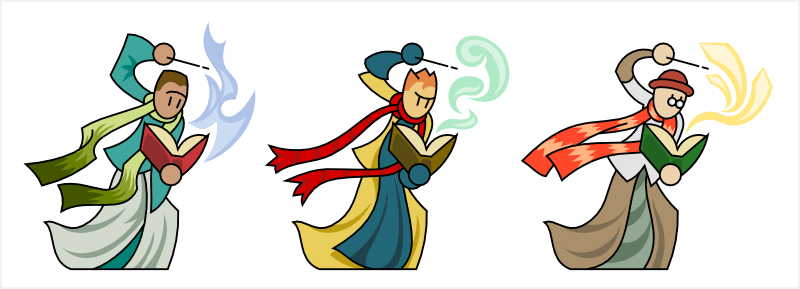
I'm sticking with doing vector colouring/shading, and I made the linework for these with that in mind. So I knew I'd be putting a coloured pattern on the scarves, and that I could demarcate #1 and #2's hair without needing to blackline it. Which is new. I used the "spare" lines left in the budget to put a little more expression on their faces. Not sure about that. I wonder if it would be better to do it on the shading layer. I think it's only a matter of time before I give up on the no-mouth line-eyes look. Style erosion.

The unlined spell effects are also new and I can see myself doing a lot more things along those lines. For these guys I deliberately avoided any sort of elemental theming. #1 has flames, yes, but they're blue so they're passable as a generic magical effect.

Next there's these satyr things. I had something else in mind while sketching, but the drunken faun is far more interesting to me. Very fond of the various boozes and goat-beards. The horns were an enormous pain in the arse. One of the downsides of vector colouring - that horn texture would have been much easier in photoshop.

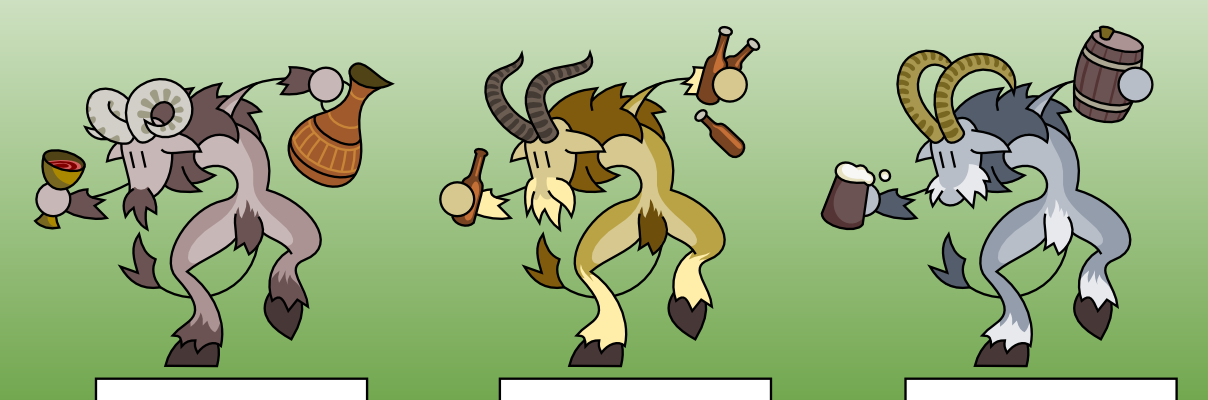
I think these satyrs are knights who have gone questing into the woods and been cursed for their unchivalric vices. In this case, the knights were drunkards. I could easily conceive of gluttonous pig-monsters and maybe slothful bear-men?

These cursed knights would fill a good niche in the theoretical game these are never going to be used for. I didn't feel like the forest witches were actually evil. Cursed monsters gives you something you can feel good about fighting, also making the witches more of a credible menace without making them evil.

Saturday, 5 January 2013

Glaivers

Not exactly new. These are modified from one of the previous generation of stick figures. One of the better ones, but I was going through another detail-inflation phase so a few parts had to be scaled back.

I thought of the original as a "dragon knight", hence the scalloped armour and weapons. Don't take that too seriously though - they're generic designs. I don't have anything interesting to say about the linework. The colours on the other hand...

The top row are what I come up with if I have a blank white screen and a default palette. I always slip into default R, G and B. Boring. The green one is ok, but they're all too Lego-coloured.

After getting annoyed by the Lego colours I redid them from interesting-looking colour palettes I found online in places like http://chromaa.tumblr.com and http://www.colourlovers.com/palettes and I'm a lot happier with the look. I wasn't slavish; I kept #3's red weapon for example.

I was deliberately restrained with the shading details. I want to use flats whenever I can get away with it. However I did shade the fleshtones, for the first time. I think that's a big improvement and something I want to keep up going forwards. It fixes a long-running problem I was having with skin tones not looking like human skin because they had no depth of colour. Faces are important and deserve extra attention. I'm still sticking with the uniform oval-shape and line-eyes, but I suspect it's only a matter of time before I give that up for flexibility, expression and character.

Friday, 28 December 2012

Colour schemes

In the theoretical game I imagine being made with all these pictures, you're meant to assemble a team pokemon-style. I'm doing multiple variations ("skins") when I can, but this raises issues I have with all games where multiple character skins are available.

Firstly it messes with character identification - silhouettes and colour are the easiest ways to ID a character and messing with that takes a toll. It's one of the many things I don't understand about dota-clones: in a game with 50+ different characters, why is anything that makes it harder to ID your opponent a good idea?

Secondly it makes groups look like an explosion in a paint factory. Everyone clashes. Compare TF2 at launch to TF2 now. Pokemon itself doesn't have a big problem here because each pokemon has a very limited number of colours and they all draw on a fairly limited palette. Also you don't see more than 2 of your pokemon on screen at once.


And I know this game will never be made and it will never be an issue, but it's a fun problem to address.

So, minimise a player's ability to customise their team. Just make it impossible to field Mr Pink, Mr Yellow, Mr Purple and Mr Green together. Drawback is that this reduces a player's ability to come up with cool-looking but unorthodox combos.

Another part of the problem is that with only three skins per figure, odds are good you can't find one that goes with your existing colour scheme.

So make more skins, or just more colour variations for each skin? That involves lots of work, multiplied across every skin I ever make. I could make it easier by homogenising the palettes, so I have a "the green palette" and a "the red palette" where each colour has a clear equivalent and I can just swap them about with no creative thought necessary. But from prior experience I know this won't work - requiring a colour pattern to look good with every available set of hues is (to put it lightly) not easy.


My frontrunner plan at the moment is colour themes. You get to choose the colour theme for your guild and every character skin is tagged to indicate what themes it is compatible with and you only get given skins compatible with your theme. For example yellow, orange, red and brown skins will all be tagged compatible with the "autumn" theme. But yellow would also be compatible with the "spring" theme. I could create new themes in the future and assess existing skins for compatibility much more easily than creating whole new skins.

This strikes me as something that will be harder in practice than it is in theory, but I'd like to at least try it out. A subtle problem with retconning incompatible skins out of the world is that it messes with character rarity - but since that's a system I've barely even thought about, I'm not fussed. There will be ways.

Big issue I see is if it means there are certain characters without a compatible skin for certain themes. To a certain extent I can make sure to create a few extra "night" or "winter"-compatible skins here and there if those themes need more love, but it's still an aesthetic choice with strong gameplay implications.

I'm not sure how I feel about that. First instinct is to run with it and see. I've a feeling it might end up being an interesting feature rather than a problem.

Thursday, 27 December 2012

Carrion Colours

Don't mind me. Just playing around with colouring for the Carrion. Much easier to do this with vector-colours.

Friday, 16 March 2012

Ruffians

At the sketch stage these were a pirate with a cutlass. After the lines were vectored it looked just like he was pulling the blade out from under his coat and I thought that was interesting enough to become the focus of the figure.

If you're pulling a weapon out of your coat, then you were hiding it. Why were you hiding it? Because you're not meant to have it. Who wears long coats and conceals weapons? City toughs! And so Mr Corsair becomes Mr Ruffian and the cutlass became improvised bludgeons.


The idea really cemented itself when I gave #2 that crazy hair. That's when I realised the OTT japanese gangster look was the way to go. #2 has it best with his bare chest and snazzy coat lining, but #3's tied trousers are pretty cute too. I think #1 looks too much like a wizard with that beard and the strange ruff - I'd hoped that the colouring would bring him more on-theme. Even tried going back to the lines to turn the ruff into a scarf, but it wasn't happening. Shame. The lead pipe is my favourite weapon though.

Speaking of which, I like the weapon variety. All things that a good leg-breaker might be carrying.Crowbar obviously coloured after Mr Freeman's, and a disquieting spatter-mark on the truncheon. And it's nifty how that little loop turns a baseball bat into a truncheon - though ribbing the handle helps make it obvious.

Modular divisions: Head, collar, belt, arms, weapon.

The colours aren't terrible, but only #2 feels right. Maybe if I had others so I could make it obvious that they're wearing gang colours? I'm missing a trick here. Not going to dwell. Plenty of time to come back to it if I have an idea.

Saturday, 3 March 2012

Swamp Hunters

They hunt swamps? I don't have a clear identity for these guys. They're a revamp of a last-gen figure I'd labelled as a skull-clan archer (#1's head on #2's body is almost the original). They feel like outdoorsmen or survivalists.


Bows are awkward because they put a lot of lines across the torso. This limits the detail that can go on the figure's clothing before it becomes cluttered. Also you really ought to give archers a quiver, which you might notice I failed to do here. I don't have a good justification, I just couldn't find a neat place to hang one.

#1's has kneepads because I liked how they made his boots femur-shaped. That's not a great reason, but it is the reason. When I coloured him I was thinking "chicken".

#2 I consciously dressed up in natural materials, then gave him the compound bow to mess with that. I like his little mantle.

#3 got away from me. He still seems like he needs something more interesting than just trousers. I tried a hanging sash, flowing cloak or loincloth but it didn't stick. And the colouring stage wasn't much easier. I repainted that sash so many times... I wanted the rest of his clothes to be neutral, naturalistic colours so the sash had to be his point of interest. Nothing seemed to work right though. The West Ham-coloured pattern is ok I guess. Maybe I should have tried to give him a better gimmick with the linework.

In contrast to a lot of my recent characters, there's barely any shading detail on these. And I'm okay with that. They didn't need it.

I spent too long writing this and now my tea's cold.

Carrion Hulk

This is a carrion hulk, an attempt at making non-generic undead. Ribcages and facelessness are good visual foci. Especially given how my normal figures don't have mouths - I can go with the flow rather than against it and then have the ribs as surrogate teeth.

This guy is either the corpse of a giant, or perhaps a monstrous product of necroscientific grafting. The silhouette was inspired by some concept art for Shadow Of The Colossus. I felt really good about the sketch and was genuinely excited to get it finished. It needed some tweaking of course. The legs were originally stick-figure but it looked too much like a person wearing a zombie torso (which isn't a bad idea for a future drawing...) and giving them bulk also gave me room for more muscle detail.

When it came to colouring I was thinking about Shingeki no Kyojin and its giants with their "half-baked" biology. I don't have the chops to match that level of anatomical accuracy, but it was an important inspiration.

I think my colours need to be redone. There's no area on this figure that doesn't have detail shading. That's not necessarily bad, but to keep it in the right style I need to be careful to keep it all sharply defined. The back is looking good (though I should have used more bone-colour instead of light flesh for the ribs coming off the spine). The chest ribs though are far too messy - you can tell that's where I started. By the time I got to the hands and feet I had a much better idea of how to achieve the look I wanted.

The fingers on the right hand are too small. I made a halfhearted effort at redoing the hand to be splayed against the ground, but didn't meet any success. In the meantime I can just about convince myself that they're dug into the ground, or curled up out of view, but honestly I need to man up and fix them.

Still I'm proud of this. It's the most complicated thing I've tried for a while and it turned out better than I'd hoped. Go me.

Sunday, 26 February 2012

Banshee and Bittervile

This is a banshee, because I was thinking about undead a lot. Sadly she's pretty generic. Still looking for that hook.

I feel bad about the low-cut gown. I think that was a mistake. It looks pretty classless. At least I didn't use the shading layer to define breasts. I want her to be ethereal flowing spirit, so I'm not looking to emphasise any human features. It's not immediately apparent when viewed on her own, but compared to human figures in this style she has circular "creature" eyes and actually has a mouth.

The mouth has a lot more shading detail then normal. It really needed the teeth to sell itself, but defining them with a line seemed too clumsy. However, since I ended up using a dark purple to outline them, I might redo it with lines when I fix the neckline.

My slacker approach to lightning was deliberate this time, because I wanted her to look ethereal. I'm not sure it's the best way to accomplish that, but it seems to work alright.

Now down here we have a bittervile. That's him on the top left. I like those colours; necrotic, ghosty and pepperminty.. Top right is a recolour I did because I wanted to see what it looked like in fire. The answer is "boring". The other two are just me playing around. Flamey/energy things are the easiest to recolour. Something about those flowing pointy shapes begs to be hue-shifted. Same happened to the werewolf with his jaggy fur.

Bittervile is a good name. If I'm going to have the convention that a *-vile is an elemental creature with a skeleton, then bitter is nine times more fun than "necro-" or "morti-"as a prefix.

The linework is pretty simple but I feel like there's a good energy in the twisting flames. The spinal column's unconvincing; I think the perpendicular lines should have been slightly curved. The skull's weird shape I'm ok with as it's meant to be a spirit rather than a physical skull. Those teeth are wrong though. I got confused and arrayed the lines rather than the teeth themselves. Silly me.

Saturday, 25 February 2012

Necromasters

These are what I made of the "liche WIP" I mentioned before. I'm not sure exactly what they are. Probably undead, certainly death-themed. Some kind of evil wizard or overlord? I'm happy enough with these guys that I want to make an undead theme just to give them a home. I don't want it to be moring and generic though. Maybe if I come up with an interesting hook. Focusing on the "death elemental" aspect rather than walking corpses? I'm not sure. It'd need to incorporate the bloaters too.


I like yhe way that their horns aren't lazily symmetrical pairs. The way the colours give them substantially different looks while staying on-theme. #1's golden belt buckle thing is a bit weak compared to the floating details on the other two (tattered cloak and gorget). I got a nice gleaming gold effect on #1 and the shine on #2's horns is cute too.

#2's eyeball-on-a-staff has more detail than usual. I just couldn't get it to work without both defining and detailing the iris. #3's staff caused problems because the skull on it was drawing too much attention from his real head. I darkened it right down and nixed all detail shading from it. After that, the glowy eyes in his helmet seemed to do the trick.

Bonus!  A dapper cindergroom. Doesn't he look civilised? See this is what I mean when I mention an interesting hook. Like the way my fire elementals are very proper gentlemen. I'm not sure how to justify it except that it appeals to me.

No variants for him. The more minimalist a design, the harder it is to mix up. I couldn't bear to ruin the cut of his suit. Ok there's something odd going on with his inside leg but I'm willing to overlook it for now.

Saturday, 18 February 2012

Angry kiln

Not sold on the name, but he's a clay golem with a fire in his belly. Fire belly? Kiln-gut? Chamber core? The pot that walks?

It's meant to look like his body is malleable clay with the head amorphously twisting out of it. His hands (on the other hand...) he's baked in his belly until they're hard. I think the legs are pre-baked to withstand the kiln's weight and heat.

I want the head to be the soft part, so maybe I shouldn't have put the fire in his eye. And his fingers appear to be spoons. I tried a variety of shapes for the fingers, but theses are what worked best so I went with them.

The blue shape behind him is... well I don't know what it is but it makes him present a little nicer I think. There's probably a name for them that I don't know of. Better than a zoom layer and doesn't require actual effort like a background would.

I've had the "internal furnace" idea for a while. My first try was this burly architect but he looked better as a strange alien. Glad I finally got a furnace-belly done finally - I like the imagery.

I'm pelased with the shape of his body. The sketch started out as exploring those curvy hips and stubby legs. The slightly pointed shoulders made me think of clay and so I added the head and then the belly.

Moderate success!

Friday, 17 February 2012

Lots of things I don't like about these. I didn't exactly rush them, but I forced myself to keep moving rather than dwelling and fixing because I worried I'd abandon them before I got them looking good.

So first, the things I do like:

The name. "Bloaters" is so perfect I'm surprised it's not been used before - slang for their fatness but also what can happen to a corpse after death. The patterns of ... lividity maybe? The patterns around their tumescent growths are cute and evocative of their deadness. To a lesser extent the blotchiness around the gaping wounds, though I worry that two different patterns of the same colour is too much fussy detail. And #3's hair. Patchy hair is something I've not done before. Finally, those cute stubby little legs.


Things I don't like

The way #2 looks like an apple core. I went overboard with the gaping wounds there but it wasn't entirely apparent until after colouring. Could probably lose the rightmost and shrink the centre one. As is it looks like his bottom half is pulling away from his torso, which isn't what I wanted. And a bit too gross besides.

Lack of swappable detail. it's heads and bodies only. I suppose the torn trouser patterns are unique too, but nobody but me will ever notice those. I'd like to have had two sets of detail on each body - chest and belly maybe.

The detail inside the wounds. Did not know what I was doing there. #1's is brainish and #3 is gutsish, but I think that's trying too hard for this style. Something less distinct would be more suitable. I need to play around and come up with something that looks suitably stylised and evocative. #2's blobby mess isn't doing it for me either.

Their wrists. I've taken them a step too far from being stick-men. The arms should have slimmed down to lines before they reached the hands. It's important to stay away from the awkward middle ground between stylised and explicit.

Finally, identity. I didn't decide what I was drawing other than "fat zombie" and so they're all over the place in character. The wounds imply fantasy necromantic zombies, but the infected blobs imply disease zombies. They might make good surgical zombies if I swapped out the blobs and wounds for stitches and patchwork. Lots of lovely space for that sort of detail. Maybe give them fuses and have them be walking bombs. Possibilities.

Not sure if I even want to do traditional necromantic undead as a theme. It's so very tired. I like the way I have things at the moment where zombies and the undead crop up as part of some other themes. I do have a funky liche WIP I mean to come back to, but he's not enough to hang a theme on. Also skeletons are crazy-hard to do when even the living are stick men.

Wednesday, 15 February 2012

Squamus magi

Tarted up from the first squagus. Though now I look back at him there's some niceness that got lost along the way. The original isn't staring into the camera, which makes the pose look more natural. On the other hand, head-on view gives them a priestly air.

It took a long while to get three compatible variations that I was happy with. I'm still not certain what #2's back fins are, or exactly how #3's tail is coiled but I can live with it. The first one is still my favourite. I completed him, colours and all, before even the linework for the other two.


Number three had to be hue-shifted at the last minute because I'd accidentally coloured him like a dratini (pokemon). This fleshy pink suits him.

There were a few patches of detail that I decided to remove. Mottling on the tentacles and so forth. Id gone too far and it made the few flat areas look bad. Even now #2's borderline overwhelming.

Conceptually these are the priests of the sea cult, devotees of the elder fish god. They don't fight, they just summon and inspire their minions. They might also have creepy fish-god magic such as ink clouds or a hypnotic gaze.

Friday, 10 February 2012

Medicators

I was so pleased with the new hospital staff I've made recently that I took a crack at revamping the mad docs. Sadly it didn't work out, but I recovered these from the ashes:


They use their syringe guns to inject people with dangerous helpful medications.

I like them overall, but there's a few issues. #1's goggles are a bit too space-man, #2 needs more line detail on the and #3 just lacks pizzaz.

I do like the fluids in the guns - the laval-lamp style blobbing makes it look nice and toxic.Unsure about #2's zipper along the neckline. Might be too subtle. Maybe I should have made the zipper a line-detail? The guns are cute and their beige plastic + bright rubberised grips colour scheme is perfectly on-theme.

I'm wondering whether I should try harder to unify the colour schemes across variations. It depends on exactly what they end up getting used for, but  if they're all just different looks for the same game entity then it's important that you recognise them easily. On the other hand maybe I could turn the bug into a feature and make variations mechanically different. I don't know.

Also "medicators" is a lacklustre name. I thought about making them phlebotomists and making the syringe guns full of blood, but I really wanted some drug-injecty guys. Vaccinators is inappropriate because the meaning is too specific. Pharmacists maybe? Ooh - ballistic pharmacists? That has potential. Not there yet but along the right lines.

Sunday, 15 January 2012

Better Euthanists

Decided those euthanists were shite. Redid them with stronger poses. Much much better. #3's face looks dumb though.

Euthanists

I think these are only about 80% there. They have lots of bits I like, and I'm happy with them overall, but they feel underbaked. Lots of "good enough" in the details that creates an unsatisfying overall impression.

Euthanists. Doctors who euthanise. Obviously I decided that a grim reaper style would be a nice way to convey that these are the death-doctors. It was fun making scythes that looked medical rather than generic reaper. Scalpel-styled steel handles for example. I'm particularly happy with the EKG blade division on #3. Painting them red also worked - I was worried it would look like blood, so I kept it off the cutting edge and did it in obvious geometric patterns.


As part of the reaper look I thought about giving them skull masks, but that pulled them too far from looking like doctors. Plague doctor masks were my compromise, and also made a kind of sense given their role. I also think bird skulls are creepy so that worked well for me. I'd have liked to incorporate some hypodermics in the design, but it didn't work nicely. Shame - lethal injection would have been a cool secondary theme.

A lot of detail here again. I put more on the garments to make sure they didn't look totally out of place behind the fancy scythes. #2's apron for example is something I wouldn't normally do.

I unified the colours more than usual because I think this special role deserves a uniform. I have a mental image of a call going out over the tannoy and, seconds later, one of these guys stalking down the corridors. I figure they have to be badass because they put down the experiments gone wrong. The special forces; the only doctors in the hospital who *deliberately* kill.

So, dark purple robes all round. Still, I made sure they all had teal and crimson details to fit in with the rest of the doctors.

Friday, 13 January 2012

Deckhands

So, more pirates. I think that calling them deckhands might be some kind of reference to their hooks, but I'm not certain.

These sit in an odd place. They have an obvious distinguishing feature - the hook - but it's not the overwhelming focus of their design. They're not excessively characterful and so would make good mooks.

On top of that, they have more colour detail than usual. See the linework was unusually open and they looked flat and boring without it. Also I'm still getting the knack of dressing pirates to look like pirates, and what seems to work best is patches of subdued colours with lots of bright detail. The hooks got some special treatment to make them stand out too - though #1's is odd. Also #2's short trousers are awkwardly uneven.

#2 was the first one of these I did, with hair inspired by Tekken's Heihachi. I tried to give him some facial hair but it just wasn't happening. #2 was coloured after Serious Sam. I'm not totally convinced by the ragged fade on his jeans and might scrap it, but the legs needed some spot detail to balance him out. The orange-striped shirt is cute and that hint of purple in his hair too.

#1 is obviously a total badass to get away with wearing a pawprint shirt. I may have been feeling silly when I did that. Same mood as when I gave #2 a shine on his pate.

Monday, 9 January 2012

Pistoliers

I was trying to do a new pirate, because honestly so far the pirates have been pretty shit. I think almost all of them need to be redone. And as a lot of my figures do, it turned out looking pretty androgynous. And since all the other pirates are male, I decided I'd roll with it and make the gunslinger a woman.

It's interesting to me that I seem to have settled on hips, thighs and shoulders as the distinguishing characteristic for women. I didn't set out with that as my plan; it was just the path of least resistance.
So as it happens when I was done with them they didn't look much like pirates any more. Far too well-dressed. Maybe they're first-mates or something. Or I might put them in the "generics" folder. Whatever.

Number two has literal hand-cannons, which amuse me. The iron sights on #3's guns are cute, because they're "free" in terms of line count, though they do require an extra node because they break the rectangle.

The gun barrels have three shades - a shadow layer and the usual metal shine. I think that, unlike flat metal, they really need that third shade to give a 3d impression.


Colours took ages to coalesce. #1 was based on a my little pony and it was all downhill from there. The result is three colour palettes I don't usually use. I'm getting more adventurous with colours and I like it. The purplish "highlight" on #2's hair is cute and gives it an interesting texture. I think that's a technique I can exploit elsewhere.

Saturday, 7 January 2012

Halberdiers

An old design fixed up to a higher standard. I can't remember what inspired this one specifically, but i remember being disappointed that it didn't turn out properly. Well, whatever it was they're ok now. They're not part of any theme I can think of, so they'll go onto the pile of miscellanea.

The detail I'm most fond of #1's scarf. I even managed to exercise restraint with the fold on the hanging piece and leave it to colour detail. #2's fur collar/snood was tricky; I liked the shape but it took a few tries to get a detail that gave it the right texture.


Colouring was hard. It took a real effort to get them nice and bright. #2's palette is a bit of a mess and I don't know how I could rescue it. I'd probably need to start over from scratch on that one. #3 is weird, but in a good way. The base colour of his trousers/sleeves and his tabard-thing is closer than I like two colours to be on the same character, but it worked really well even before the gold detailing.

For the weapons I made sure that they all had a hooked part. I wanted them to be obviously funky polearms without looking like axes.

Tuesday, 3 January 2012

Scalpel Ninjas

They need a proper name yet. Scalpel ninja was the concept though. The pose is silly by design. i was pushing for something unnecessarily dynamic and this happened. Not ideal for holding the scalpels though. Perhaps its some ninja rest pose after they've incised somebody. Or a weird martial arts stance.

Incisors would be a good name for them, but then I'd need to rename these guys. It really suits the ninjas though.

Blood continues to be a pain to do. I didn't really want to bloody their scalpels at all. It's all on its own layer so I can clean it easily enough. Yeah, the more I think on it the more I think the blades should be shiny and clean.
I'd like to talk about the scalpels themselves. I took pains to make them look like scalpels and not generic fantasy blades. That's why they're all single pieces of metal. I also differentiated them from my usual blade style by not having a line to delineate the bevel to the edge. The idea is that it makes them look sharper. Also those holes in the blade seem a nice compromise between fantastic and surgical.

I'm fond of the grip details on the hafts. I nearly did those as line detail but I'm glad I left it to the colouring. Similarly, #2's arm bandages. There wasn't enough room to do those with black lines. And now it's got me wondering whether I should have done his head the same way. An awkward middle ground.

I've expanded the colour palette for the surgery theme. That lovely turquoise is still centre stage but I think when I revise the earlier figures I'll use more dark red, buff and that purplish brown.

Monday, 2 January 2012

Diving suits

Obviously heavily inspired by Bioshock's weaponised diving suits. A good idea is a good idea. These seemed a good way to add more body-types to a sailors/pirates theme

I didn't expect to be able to make variations, but it came together pretty neatly. Harpoon guns were a pain though, because the original was rotated at an arbitrary angle that I had to try and match. #2's gauntlets are my least favourite part.


I went wild with the detail layer. Possibly a bit too wild. And that verdigris is... wrong. I like how it looks, but there's no escaping that that's just not how verdigris develops. And it's too intricate besides. #1 was the last one I detailed though and I'd already used up the best ideas on #2 and #3.

I was going to do a boring gem-type shine on the faceplates, but this murky reflection is so much nicer. I'm also happy with the colours. Surprised that I managed to get a nice aquatic-feeling palettes that neither overlap nor diverge too much.

Hmm - should I have given them air hoses?